Lauren Rodriguez | Designer & Visual Problem Solver based in Salt Lake City, UT
Checkout Payments
In Progress // Process
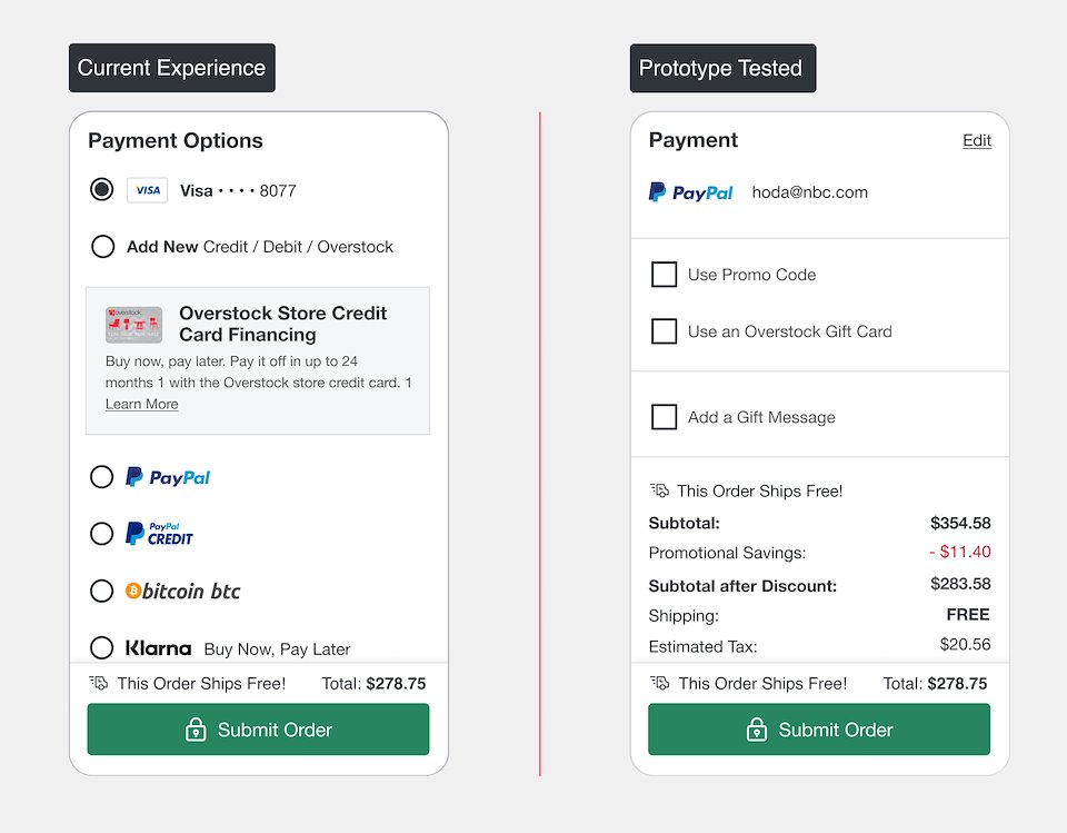
Overstock provides its customers with several payment options on the checkout page.
During qualitative interviews about the checkout experience, I noticed several comments around how many payments options were on the page. The assessment was not negative, but the number of payment options did stand out to the customer.
The goal of this project is to simplify and declutter the payments section, while still providing payment options to the customer.
RoleSr. UX Designer, Qualitative Researcher Date2021 Product ManagerEmily HoweProblem Statement & Hypothesis
Return customers are seeing all our payment options in addition to their last payment type, which may require more critical thinking to review the payment section, especially given that returning customers with payment methods saved switch to a new type of payment less than 2% of the time.
Simplifying the payment section for return customers will decrease the amount of time a customer takes to complete checkout and reduce the cognitive load for our customers. We'll know this by measuring the increase or decrease in completed orders and time on tasks.
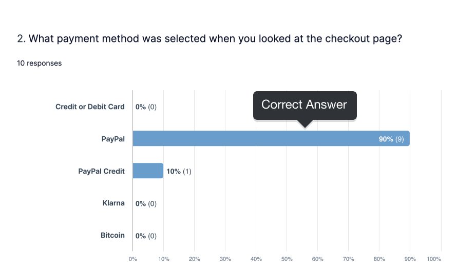
I had testers go navigate through a prototype and perform a series of tasks to ensure the customer was able to easily change payment types and learn of any unforeseen friction points.
I think the store card sign up could have been a bit more prominent
No, all very clear
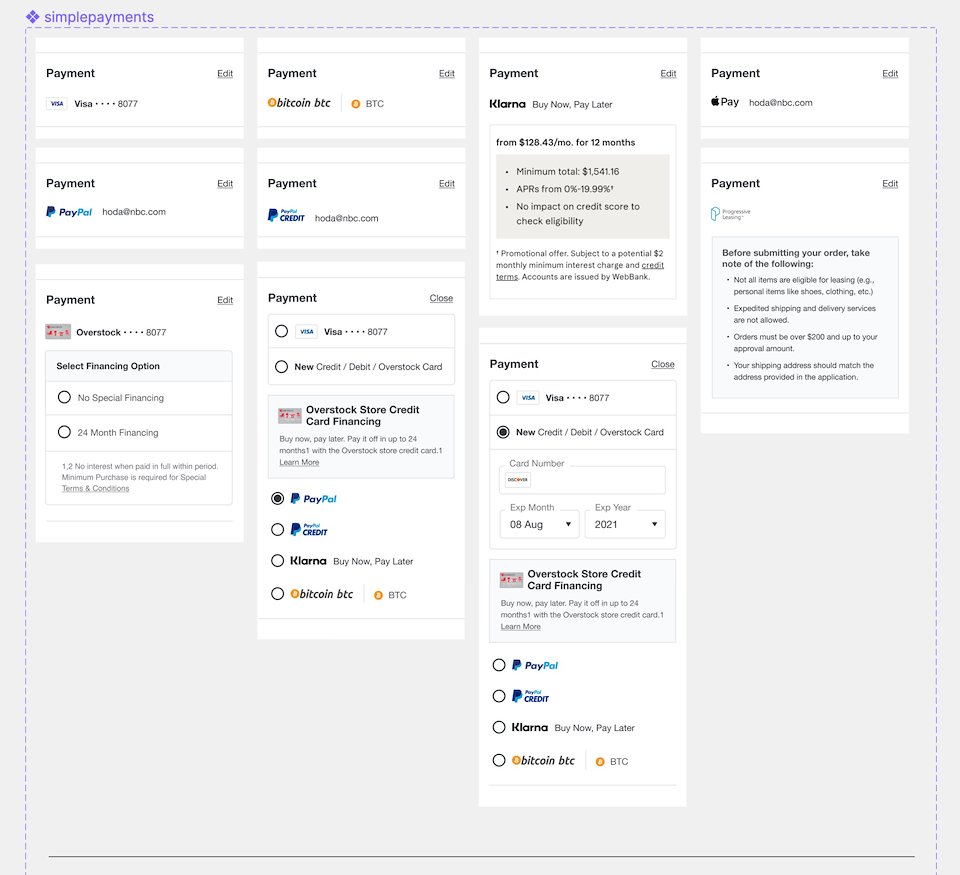
My next steps included working through the qualitative feedback, making sure store card visibility had been accounted for and my design has addressed each payment type. Thanks to Figma's variants I was able to include them all in one component, making demos with a prototype simple.
Improved Email to Site UX Next
Checkout Navigation Research Sample